

Many of us recognize brand logos instantly without paying much attention to the details behind them. However, some of the world’s most recognizable designs are carefully created to reflect a company’s identity through color, shape, and typography. That’s why people often enjoy taking a closer look at familiar logos to better understand the design choices behind them.
One logo that regularly sparks curiosity is Lay’s. Its bright colors and distinctive design have remained familiar to shoppers for decades, leading many people to wonder whether there’s more to the logo than first meets the eye.
A Simple Yet Memorable Design
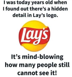
The Lay’s logo features bold white lettering set across a red banner with a large yellow circle in the background. While the design appears straightforward, branding professionals note that each element serves a purpose.
The bright yellow helps create a cheerful, energetic appearance, while the red banner naturally draws attention and makes the brand name stand out on store shelves. Together, these colors have helped make Lay’s one of the most recognizable snack brands worldwide.
A Connection to the Parent Company
Some observers have noticed that the yellow circular background resembles elements found in the logo of Frito-Lay, the company behind the Lay’s brand.
Rather than being a hidden symbol, this similarity is generally considered part of a broader branding strategy. Large companies often use related design elements across multiple products to create a consistent visual identity while allowing each brand to maintain its own unique look.
A Logo That Has Evolved Over Time
Lay’s traces its history back to 1932, when Herman Lay began selling potato chips. As the company grew, its logo was updated several times to reflect modern design trends while preserving the familiar appearance customers had come to recognize.
Although small refinements have been introduced over the years, the overall design has remained remarkably consistent, helping strengthen the brand’s identity.
Why Logo Design Matters
Branding experts explain that effective logos are designed to be simple, memorable, and easy to recognize.
Carefully selected colors, shapes, and fonts help create a visual identity that customers can quickly identify, whether they’re browsing store shelves or seeing an advertisement.
In the case of Lay’s, the logo focuses on clarity and consistency rather than hidden messages.
Looking Beyond the Surface
Discussions about famous logos continue to capture people’s interest because they encourage us to notice details we might otherwise overlook. While some logos include subtle references to a company’s history or heritage, many are designed primarily to build recognition and create a consistent brand image.
The Lay’s logo is a good example of thoughtful branding. Its familiar combination of color, shape, and typography has helped make it one of the most recognizable food logos around the world.
The next time you see a bag of Lay’s chips, you may find yourself appreciating not only the snack inside but also the careful design choices that have helped the brand remain instantly recognizable for generations.
Leave a Reply